OVERVIEW
Data Stores is Komprise's primary navigation, used daily by IT Admins to oversee petabyte-scale storage
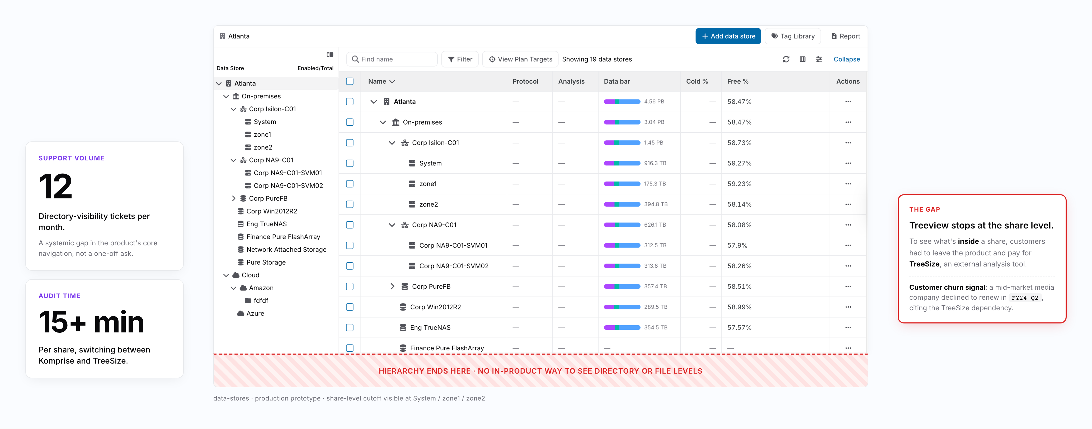
Komprise provides hybrid cloud data management for enterprises like Pfizer, Nike, Paramount, and Morgan Stanley managing petabytes of unstructured data. Data Stores is the product's primary navigation, where IT Admins drill through a six-level entity hierarchy daily to oversee what their organizations are storing across on-premises and cloud tiers. But the existing browsing experience hit a wall: customers couldn't see what was inside their shares without leaving the product. As the designer, I validated the problem, designed a component reusable across the product, and replaced the overall navigation pattern from treeview to drill-down, letting users explore down to the directory level for the first time.
SUPPORT TICKETS
-83%
from 12 per month to 2, directly attributable to resolved directory visibility gap
TASK COMPLETION
+40%
drill-down averaged 28 seconds vs 47 seconds for treeview (n=6, controlled lab task)
DESIGN SYSTEM ADOPTION
4 product areas
Entity bar component reused without modification across Data Stores, Reports, Workflows, and Directory Browser, validating the system-level design approach across the unified drill-down architecture
PROBLEM
No directory visibility meant every data audit required leaving Komprise for external tools
A single data audit required IT Admins to switch between Komprise and external analysis tools, taking 15+ minutes per share. A mid-market media company declined to renew in FY2024 Q2 specifically because they had to maintain a separate TreeSize license just to see what was inside their shares. Directory-visibility support tickets averaged 12 per month, representing a systemic gap in the product's core navigation capability. The initial assumption from stakeholders was that extending the existing treeview deeper would solve the problem.
Customers could not identify which directories were consuming storage or which folders needed archiving without external tools
RESEARCH & DISCOVERY
Missing visibility was the surface problem. The navigation pattern itself was the deeper one
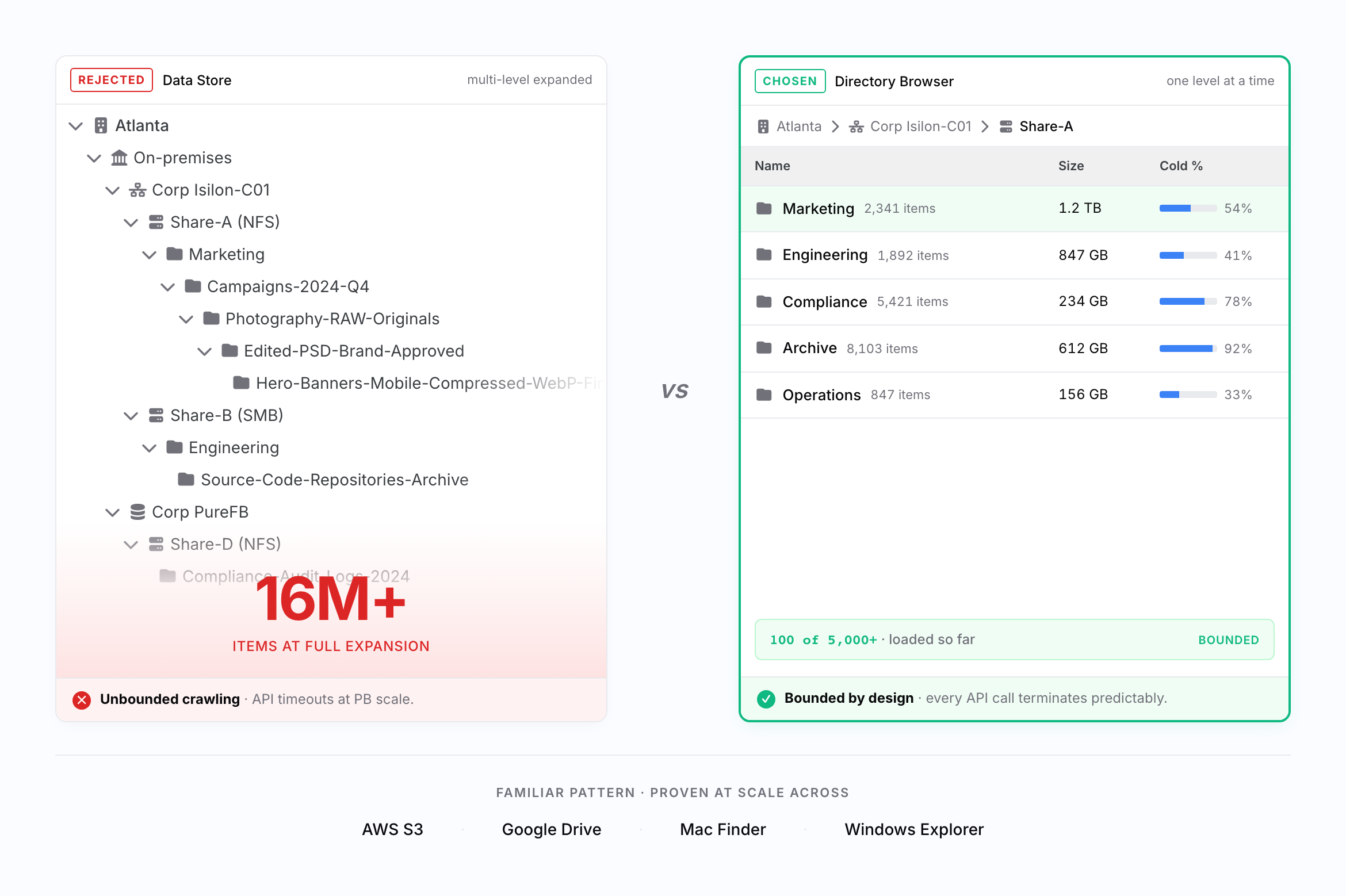
The stakeholder assumption was that extending treeview to Directory and File levels would close the visibility gap. Extending the depth would technically restore visibility, but research surfaced two deeper problems that made the extension approach itself unworkable. An early developer feasibility review confirmed that treeview could not scale beyond millions of nested items without causing unbounded data crawling and API timeouts. But the deeper finding came from user research with six stratified participants across IT Admins and Restricted Users spanning enterprise, media, and healthcare verticals. Users did not think of directory browsing as "expanding a tree." They expected click-and-explore navigation like their OS file explorer. Even if treeview could scale, it would still impose a mental model that did not match how users naturally navigate hierarchies. This reframed the problem from "how do we extend treeview deeper" to "what navigation pattern serves both user mental models and petabyte-scale performance constraints." Benchmarking AWS S3, Google Drive, Windows Explorer, and Mac Finder confirmed that drill-down was the dominant pattern across all leading storage browsers.
Mental Model Mismatch
Users expected click-and-explore navigation like OS file explorers, not database query workflows. They wanted to drill into folders and see children immediately.
Treeview Scalability Collapse
Expanding multiple treeview branches simultaneously required loading unbounded data volumes. A single share with 16M+ nested items could not coexist with multi-branch expansion without exceeding API timeout thresholds.
Competitive Pattern Validation
AWS S3, Google Drive, Windows Explorer, and Mac Finder all employ drill-down navigation, showing one level at a time. This external validation provided confidence that drill-down was both familiar and proven at scale.
DESIGN PROCESS
From infeasible extension to a unified drill-down refresh
My initial assumption was to extend the existing treeview to deeper levels. An early developer feasibility review killed that direction within weeks, preventing months of wasted design work. I then benchmarked competitor storage browsers, synthesized research insights, and proposed drill-down as the primary pattern. PM initially preferred treeview for consistency but aligned after I presented comparative prototype testing results. With architectural unification as the chosen direction, we accepted a longer delivery timeline to refresh the entire product to drill-down in a single release rather than ship a hybrid that mixed two paradigms in one user session.
Feasibility Review
Conducted developer consultation on treeview extension feasibility. Finding that PB-scale data with millions of nested directories causes API timeouts killed the extension approach early.
Competitive Benchmarking
Analyzed drill-down patterns across AWS S3, Google Drive, Windows Explorer, and Mac Finder to validate that one-level-at-a-time navigation is both familiar and proven at scale.
Prototype Testing
Built drill-down and treeview prototypes and tested with six participants on representative directory-finding tasks to generate comparative data for the decision.
Stakeholder Alignment
Presented testing results and performance feasibility to PM. Aligned on full drill-down conversion across all navigation levels in a single release, accepting a longer timeline to avoid forcing users through a paradigm mix mid-session.
DESIGN GOAL
Three explicit goals that anchored the navigation pattern before any UI was drawn
Before designing the navigation pattern, I translated the research findings into three explicit goals. Each came from a distinct constraint (performance, mental model, and architecture), and the solution had to satisfy all three without compromise. Starting from these goals kept the navigation pattern decision honest to research rather than driven by stakeholder preference, and forced component-level thinking from day one.
Bounded performance at petabyte scale: every API call must terminate predictably, regardless of directory size. No unbounded loading, no infinite progress states. This was the foundational technical constraint that separated a feature working at demo scale from one working at customer scale.
Familiar mental model: match the OS file explorer pattern users already know. No new interaction model to learn. Familiarity reduces the cognitive cost of deep-hierarchy navigation, especially when users drill through six entity levels in a single session.
Reusable system-level component: whatever component pattern emerged would inevitably be inherited by other product areas (Data Stores, Reports, Workflows). Design at the system level from day one, not as feature-local UI but as foundation infrastructure that compounds value across the product.
SOLUTION
Drill-down browsing system with cursor pagination and breadcrumb orientation
I designed a three-part solution that replaced treeview with a familiar, performance-safe drill-down pattern. First, a main table showing one entity level at a time with interactive entity bar rows. Users click into a directory to see its children, exactly like a file explorer. Each row supports hover states, selection, and right-click menus for actions like view details, download details, and copy path. Second, breadcrumb navigation that tracks the user's position across the full hierarchy, truncating with ellipses as paths deepen but keeping recent segments visible so users always know where they are. Third, cursor-based pagination showing "100 of 5,000+", solving lazy loading timeouts by displaying partial results immediately while progressively loading the rest. I designed the entity bar component at the design system level, anticipating reuse beyond Directory Browser. The whole solution was designed to disappear, to feel like Finder, S3, or Explorer rather than something new to learn. Familiarity was the goal; novelty was a risk.
Interactive Entity Bar Component. Designed at design system level with clear interaction states (default, hover, selected, disabled) and right-click context menus. Built on atomic design system for reusability across Directory Browser, Data Stores, Reports, and Workflows.
Breadcrumb Navigation with Smart Truncation. Tracks user position across the full hierarchy. Truncates with ellipses as paths deepen while preserving recent segments, allowing jumps back to any ancestor level. Keeps users oriented during deep drilling.
Cursor-Based Pagination with Progressive Loading. Loads 100 items at a time within each level, displaying full scope with "100 of 5,000+" indicators. Progressive loading handles API timeout risks while showing results immediately. Constraint-driven design that improved UX by surfacing bounded data chunks.
KEY DECISION 1
Permanent hybrid vs full architectural unification
Drill-down was decided as the right navigation pattern, but the next decision was scope. Two real architectural options were on the table, both with substantial tradeoffs. Engineering flagged that a full rewrite was a large code change and recommended the hybrid as a pragmatic compromise. I initially aligned with that view, until I tested a hybrid prototype with users. Every participant hit the same confusion at the seam ("Why did the chevron disappear?" "Where did the breadcrumb come from?"). Shipping the hybrid would have made this break permanent: every user, every session, forever. I changed my position and went back to argue for full unification. The reframe to leadership was simple: timeline cost is one-time, seam cost compounds forever. Spending the extra time once preserved the unified mental model from day one of release.
OPTION 1
Permanent hybrid: keep treeview at upper Data Stores levels (Share and above), introduce drill-down only at Directory and File levels. Two patterns as the final state.
Faster delivery (no upper-level rework), preserved familiarity for users already used to treeview.
OPTION 2 / CHOSEN
Full architectural unification: replace treeview with drill-down across the entire product in a single release.
Longer delivery timeline accepted to ship one consistent navigation pattern from day one.
KEY DECISION 2
Determining the right pagination threshold for petabyte-scale directories
Drill-down solved the unbounded loading problem at the navigation level, but a new challenge emerged within each level: a single directory could contain 5,000+ subdirectories. Loading all of them at once recreated the same timeout problem we had just solved. The question became how many items to load per page. I tested three thresholds with engineering. 50 items kept responses under 1 second but required too many pagination clicks for directories with thousands of children, and users felt they were "missing the picture." 200 items pushed API response times past 3 seconds, which our testing showed was the threshold where users perceived the system as slow. 100 items hit the balance: responses stayed under 3 seconds, and users could scan enough content to orient themselves before loading more. The "100 of 5,000+" scope indicator was critical. Without it, users had no way to know how much more existed. I tested showing the count versus hiding it, and users without the count asked "is this everything?" while users with the count immediately understood the scale and paged forward confidently.
IMPACT
40% faster tasks, 83% fewer tickets, and one entity bar across four product areas
SUPPORT TICKETS
-83%
from 12 per month to 2, directly attributable to resolved directory visibility gap
TASK COMPLETION
+40%
drill-down averaged 28 seconds vs 47 seconds for treeview (n=6, controlled lab task)
DESIGN SYSTEM ADOPTION
4 product areas
Entity bar component reused without modification across Data Stores, Reports, Workflows, and Directory Browser, validating the system-level design approach across the unified drill-down architecture
Directory-visibility support tickets dropped from 12 per month to 2, an 83 percent reduction that directly reflects the feature's impact on core user pain. A controlled lab study with six participants showed drill-down completed target tasks in 28 seconds vs 47 seconds for treeview, a 40 percent improvement, with five of six users preferring the pattern. Sample size is small by design (usability lab study, not production analytics), but the signal direction was consistent across participants and verticals. The mid-market media company that had declined renewal in FY2024 Q2 specifically due to lack of directory visibility re-signed after launch, citing the feature as the deciding factor. Full-cohort renewal attribution remains imprecise (other improvements shipped in the same period), but this single-account causal signal stands. Beyond these direct outcomes, the entity bar component I designed was adopted by another designer for Data Stores, Reports, and Workflows. One entity bar, four product areas. System-level component design compounded value more strongly than any upfront planning could have, and powered the unified drill-down architecture across the entire product.
IMAGE PLACEHOLDER
Entity bar adoption diagram. Directory Browser에서 시작한 entity bar 컴포넌트가 Data Stores, Reports, Workflows 4개 제품 영역으로 확장되는 화살표 도식. "system-level component design compounds value"를 시각적으로 증명. 디자인 시스템 포지션에 직접 어필하는 cross-product adoption 시각화
LEARNINGS
Performance constraints belong in the design brief, not the engineering ticket
Before this project, if I'd seen "API can time out past 3 seconds" in a doc, I would have treated it as an engineering constraint to route around. After Directory Browser, timeout thresholds are the first line of my design brief. The bounded "100 of 5,000+" pattern tested better than an unbounded list. Users preferred bounded chunks with scope indicators because the constraint forced a more thoughtful interaction than I would have designed without it. The second lesson was about components: I designed the entity bar as atomic infrastructure, not as Directory Browser feature UI. That's why another designer was able to pick it up and ship it across Data Stores, Reports, and Workflows without modification. If I'd scoped it locally, that adoption never happens. Designing for reuse from day one is now a default, not an aspiration.
Performance constraints belong in the design brief, not the engineering ticket. Timeout thresholds are now the first line of my design brief. The bounded "100 of 5,000+" pattern emerged from a 3-second API ceiling and tested better than the unbounded version. The constraint produced a more thoughtful interaction, not a worse one.
Atomic infrastructure, not feature UI. Entity bar designed as a system-level atomic component meant another designer could pick it up and ship it across three more product areas without modification. Local scoping would have killed that adoption. Designing for reuse from day one is now a default, not an aspiration.
Navigation decisions define infrastructure scope. Pattern choice was not a UI preference but a system-level decision affecting performance ceilings, component architecture, and multi-year interaction model. Unifying the entire product under drill-down confirmed this: it became the foundation across every product area.
NEXT STEPS
Measurement maturity, design system scaling, and post-launch monitoring
With drill-down now powering all navigation across the product, the next priorities focus on measurement maturity, design system expansion, and post-launch monitoring. Directory Browser was directionally successful, but retrospective attribution remained imprecise. Future feature releases need feature-level analytics instrumented from day one. The entity bar adoption story also points to a broader component library opportunity worth investing in. And while drill-down is dominant in early signals, we are monitoring whether any edge-case workflows might benefit from selective treeview support.
Design System Scaling: Entity bar adoption across four product areas validated the design system approach. Document reusable patterns and expand the atomic component library to support future feature work and accelerate cross-product consistency.
Instrumentation and Metrics: Implement feature-level analytics from day one for future releases. Track active user sessions, session depth by feature area, and task completion rates. Use phased rollout with comparison cohorts to isolate feature impact rather than relying on retrospective attribution.
Treeview Restoration Evaluation: Monitor feedback on whether any edge-case workflows or user segments would benefit from selective treeview restoration. Current data suggests drill-down is dominant, but watch for niche cases where hierarchical scanning may still serve a real need.